
TradingView is a powerful platform used by over 50 million traders and investors worldwide, offering state-of-the-art tools for charting, technical analysis, and market research. While many users are familiar with its charting tools and indicators, there’s one incredibly useful feature that’s often overlooked: the TradingView Heatmap.
Table Of Content
- What is the TradingView Heatmap?
- ✅ Key Benefits of Using the TradingView Heatmap
- 1. Instant Visualisation of Market Trends
- 2. Save Time and Avoid Manual Work
- 3. Sector & Asset Class Comparison
- 4. Track Volatility and Relative Volume
- 5. Gauge Overall Market Sentiment
- 6. Adaptable for All Timeframes
- 🚀 How to Access the TradingView Heatmap
- Step 1: Log in and Navigate to Products
- Step 2: Choose a Market or Index
- Step 3: Customize Your View
- 🔘 Size By
- 🎨 Color By
- Step 4: Use Advanced Filters
- 📊 Practical Use Cases
- 🔎 1. Finding Breakout Opportunities
- 💰 2. Dividend Investing
- 🔁 3. Sector Rotation Analysis
- 📉 4. Spotting Overbought/Oversold Assets
- 💡 Pro Tips to Make the Most of It
- 📱 Heatmaps on Mobile and Desktop Apps
- 📈 Heatmaps for Crypto Traders
- 🧠 Final Thoughts: Should You Use TradingView Heatmap?
- ✅ Quick Summary
- 📎 Useful Links
- What is the TradingView heatmap?
- Where can I find the heatmap on TradingView?
- What data does the heatmap show?
- What do the colours on the heatmap mean?
- Can I filter the heatmap by sector or region?
- Does TradingView have a crypto-specific heatmap?
- How often is the heatmap updated?
- Can I customise the heatmap view?
- Is the heatmap available to free users?
- Can I use the heatmap for technical analysis?
- What’s the difference between a heatmap and a screener?
- Can I export or share the heatmap?
In this guide, we’ll take a deep dive into TradingView’s Heatmap functionality, walking you through what it is, why it’s so valuable, and most importantly—how to use it effectively to uncover market trends, find investment opportunities, and save hours of manual research.
What is the TradingView Heatmap?
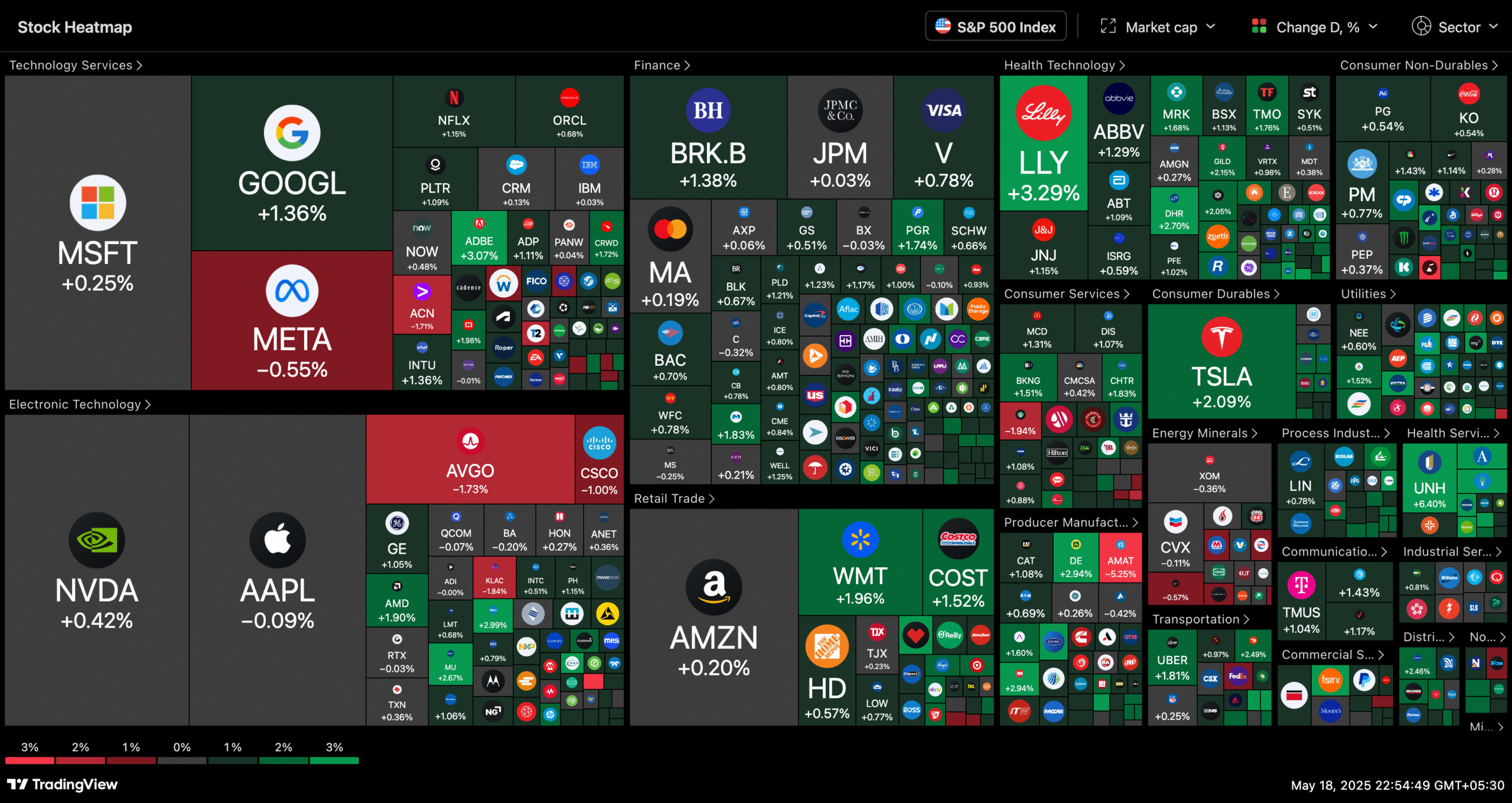
The TradingView Heatmap is a visual representation of market data, where individual assets (like stocks or cryptocurrencies) are displayed as colour-coded squares or rectangles within a grid. The colour and size of each square represent a specific metric—such as price change, volume, or market cap—offering a high-level snapshot of the market at a glance.
The colours typically range from:
- Green: Price has increased (bullish sentiment)
- Red: Price has decreased (bearish sentiment)
- Lighter shades: Indicate milder movements
- Darker shades: Suggest stronger movements or higher volatility
This intuitive display enables traders to quickly identify winners, losers, volatile movers, and emerging trends across sectors or markets, without needing to sift through dozens of charts.
✅ Key Benefits of Using the TradingView Heatmap
Let’s explore why the Heatmap deserves a place in every trader’s workflow:
1. Instant Visualisation of Market Trends
The heatmap eliminates the need to open multiple charts or scroll through endless tickers. Instead, you get a complete bird’s-eye view of what’s happening in the market right now.
Example: In just one glance, you can spot that Tech is red, Energy is green—clearly indicating sector rotation.
2. Save Time and Avoid Manual Work
Analysing dozens or hundreds of assets manually can be exhausting. With the heatmap, everything is colour-coded and organised for you. It’s a serious time-saver.
3. Sector & Asset Class Comparison
You can compare sectors like Finance, Technology, Healthcare, and more—all side by side. Whether you’re a portfolio manager or a retail investor, this helps identify outperformers and underperformers.
Example: If the Financial sector is deep green while Tech is flashing red, that may indicate a shift in market favour.
4. Track Volatility and Relative Volume
The Heatmap isn’t limited to price performance. You can also colour-code or size by:
- Volatility
- Volume
- Relative volume
This gives deeper insights into how intensely an asset is trading, and not just where it’s moving.
5. Gauge Overall Market Sentiment
A mostly green heatmap signals bullish sentiment, while a red one suggests widespread selling pressure. This visual cue is great for gauging macro market sentiment without needing to run analytics.
6. Adaptable for All Timeframes
Whether you’re a day trader, swing trader, or long-term investor, the heatmap allows you to adjust the timeframe to 1H, 1D, 1W, 1M, YTD, and more.
🚀 How to Access the TradingView Heatmap
Here’s a step-by-step guide to accessing and using the heatmap on TradingView:
Step 1: Log in and Navigate to Products
- Log in to your TradingView account.
- At the top of the platform, click on “Products”.
- From the dropdown, select “Heatmaps”.
You’ll find two main options:
- Stock Heatmap
- Crypto Heatmap
Choose the one relevant to your market focus.
Step 2: Choose a Market or Index
By default, you’ll see the US stock market heatmap. But you can change this to:
- Nasdaq 100
- S&P 500
- Dow Jones
- European stocks
- Indian markets
- Crypto markets
- And more
To change the index:
- Click on the source option in the top-left corner.
- A dropdown menu will appear with available indices from various global markets.
Step 3: Customize Your View
Once your heatmap is loaded, here’s how you can customize it:
🔘 Size By:
This controls the size of each square. Options include:
- Market Cap (default): Larger market cap = bigger block.
- Number of Employees: Visualizes workforce size (e.g., Walmart vs McDonald’s).
- Dividend Yield (%): Higher yield = bigger size.
- P/E Ratio: Highlights valuation; high P/E = larger block.
- P/S Ratio (Price-to-Sales): Shows value based on revenue.
- P/B Ratio (Price-to-Book): Indicates asset-based valuation.
- Volume (1h, 4h, D, W, M): Based on shares traded in a time interval.
- Volume x Price: Adjusts for stock price, helpful for filtering penny stocks.
Each option provides different insights. For example:
- Market Cap shows which companies dominate in terms of valuation.
- P/E Ratio highlights valuation extremes (overvalued/undervalued).
- Volume highlights the most traded stocks for short-term traders.
🎨 Color By:
This controls how each square is colored, and it reflects performance over timeframes such as:
- Performance (1h, 4h, D, W, M, YTD, 1Y): Green for gains, red for losses.
- Volatility: More volatile assets show stronger shades.
- Relative Volume: Highlights spikes in trading volume relative to average.
- Technical indicators: Some configurations allow for coloring by RSI or moving averages.
For example, if you choose “Performance, 1D”, then stocks that are up today will appear green and those down will appear red.
Step 4: Use Advanced Filters
You can further refine the heatmap using filters for:
- Sectors
- Industries
- Market Cap (Large, Mid, Small)
- Exchange
- Country
These filters are especially helpful for narrowing down your focus to the exact type of stocks or assets you want to analyse.
📊 Practical Use Cases
Here are a few scenarios where the TradingView Heatmap truly shines:
🔎 1. Finding Breakout Opportunities
Set the heatmap to color by “Performance 1D” and size by “Volume.” This can help you spot high-volume gainers—often a sign of strong institutional interest or news-driven momentum.
💰 2. Dividend Investing
Size by Dividend Yield and filter for Large Cap stocks. Instantly discover reliable dividend-paying stocks across sectors.
🔁 3. Sector Rotation Analysis
Compare past 3-month or 6-month performance across sectors. You’ll quickly identify which sectors are heating up and which ones are cooling off.
📉 4. Spotting Overbought/Oversold Assets
Use size by P/E ratio or P/B ratio and compare against sector peers. This can help identify overvalued or undervalued stocks for long-term value investing.
💡 Pro Tips to Make the Most of It
- Bookmark custom heatmaps: Save specific heatmap setups for quick access next time.
- Combine with screeners: Use the stock screener alongside the heatmap for deeper filtering and technical signals.
- Use dark mode: It improves color contrast and makes heatmaps easier on the eyes during long analysis sessions.
- Share with team or followers: Use the share button to post custom heatmaps on social media, blogs, or in community discussions.
📱 Heatmaps on Mobile and Desktop Apps
TradingView heatmaps are accessible on:
- Web (tradingview.com)
- Desktop app (Windows/Mac)
📈 Heatmaps for Crypto Traders
Crypto traders can use the Crypto Heatmap for analysing:
- Top Gainers/Losers
- Altcoin performance vs. Bitcoin
- Relative strength across Layer 1, DeFi, Meme coins, etc.
Bonus tip: Filter by market cap tier (micro-cap, small-cap) to find hidden gems.
🧠 Final Thoughts: Should You Use TradingView Heatmap?
Absolutely.
Whether you’re a day trader, swing trader, investor, or analyst, the TradingView Heatmap is a versatile tool that can:
- Speed up your decision-making
- Enhance visual clarity
- Improve your understanding of market dynamics
Take 5 minutes today to explore and customise your own heatmap—you’ll wonder how you ever traded without it.
✅ Quick Summary
| Feature | Benefit |
|---|---|
| Heatmap Overview | Instant market sentiment |
| Size By Options | Market Cap, Volume, Ratios |
| Colour By Options | Performance across timeframes |
| Global Index Support | US, EU, Asia, Crypto |
| Custom Filters | Sector, Market Cap, Country |
| Sharing & Saving | Easy collaboration and access |
📎 Useful Links
What is the TradingView heatmap?
The TradingView heatmap is a visual tool that displays the performance of various stocks, cryptocurrencies, or other assets, using colour intensity to represent price changes—green for gains, red for losses.
Where can I find the heatmap on TradingView?
You can access the heatmap from the “Products” section on the TradingView homepage or directly through this URL: https://www.tradingview.com/heatmap/.
What data does the heatmap show?
It shows real-time or delayed data on asset price changes, market capitalisation, ticker symbols, and percentage change. The data is sorted by sector, industry, or asset class.
What do the colours on the heatmap mean?
Green indicates positive price movement (gains), while red shows negative price movement (losses). The darker the shade, the more significant the price change.
Can I filter the heatmap by sector or region?
Yes, the heatmap allows filters by sector, industry, market cap, region, and even exchange, helping you narrow down your analysis.
Does TradingView have a crypto-specific heatmap?
Yes! There’s a separate Crypto Heatmap that shows price movements of cryptocurrencies like BTC, ETH, and altcoins.
How often is the heatmap updated?
The heatmap updates in near real-time for most markets. However, data may be delayed for certain exchanges depending on your account type (free vs. paid).
Can I customise the heatmap view?
Absolutely. You can adjust the timeframe, colour intensity, data display (price, % change), and apply filters to create a more personalised heatmap experience.
Is the heatmap available to free users?
Yes, TradingView offers the heatmap to all users, although some advanced features (like real-time data from certain exchanges) may require a paid plan.
Can I use the heatmap for technical analysis?
While the heatmap itself is not a technical analysis tool, it helps you identify opportunities by showing which assets are moving, allowing you to dive deeper using TradingView’s charting tools.
What’s the difference between a heatmap and a screener?
A heatmap provides a visual representation of market movement, while a screener offers a data-driven table format with more detailed filters like RSI, volume, moving averages, etc.
Can I export or share the heatmap?
You can’t directly export the heatmap, but you can take screenshots, share links, or use it in conjunction with TradingView’s tools to create and share analysis.
Found this guide helpful? Feel free to bookmark it, share it with fellow traders, and follow along for more straightforward, experience-based insights. I’m simply here to share what I’ve learned along the way — no hype, just honest trading lessons.


